ALDERWOOD CREATIVE REBRAND + PRINT & PROMOTIONAL MATERIALS


ALDERWOOD CREATIVE ICONOGRAPHY + COLOR PALETTE


-
Redesigning the branding for Alderwood Creative, the company I’m proud to be a part of, has been one of the most rewarding creative challenges I’ve taken on. This was not just about refreshing a logo or choosing new colors; it was about capturing the heart of a company that means so much to so many in our community.
From the early concept sketches through the final rollout, the process was deeply collaborative and powered by the incredible talent and energy of our team. I’m grateful to have led the creative direction on this rebrand and to help shape the next chapter of a place I truly believe in.
-
The foundation of Alderwood Creative’s rebrand was built on collaboration. I worked closely with our team to explore who we are as an agency, the people we serve, and the culture that drives us. These early conversations helped define not only what we do, but also the values and personality that set us apart.
Understanding our internal dynamics was just as important as analyzing our outward presence. Our founder played a central role in shaping the strategy, bringing a strong ability to identify problems and guide thoughtful solutions. With her background in creative writing and her attention to detail, I knew the brand needed to reflect those qualities in an authentic way.
-
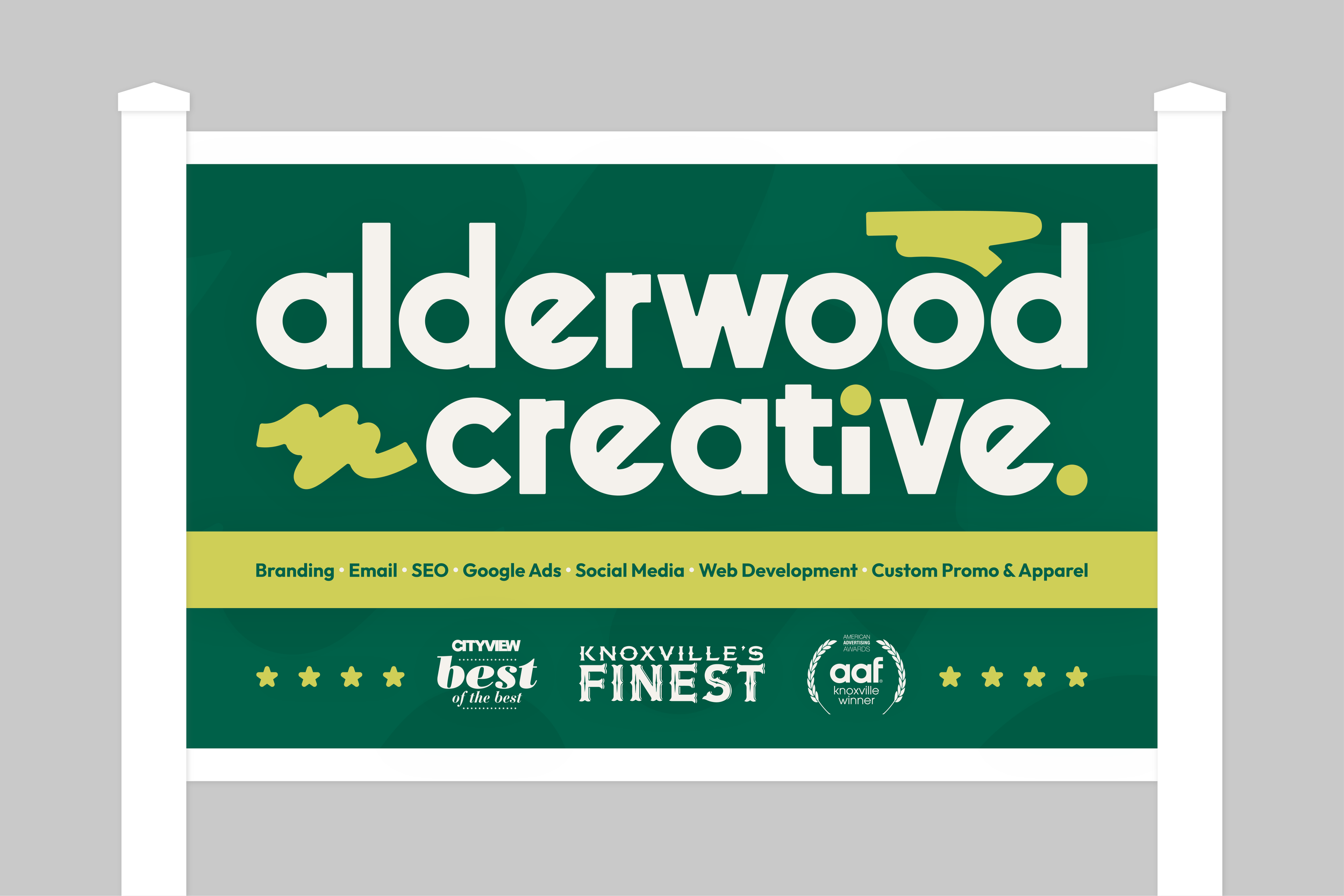
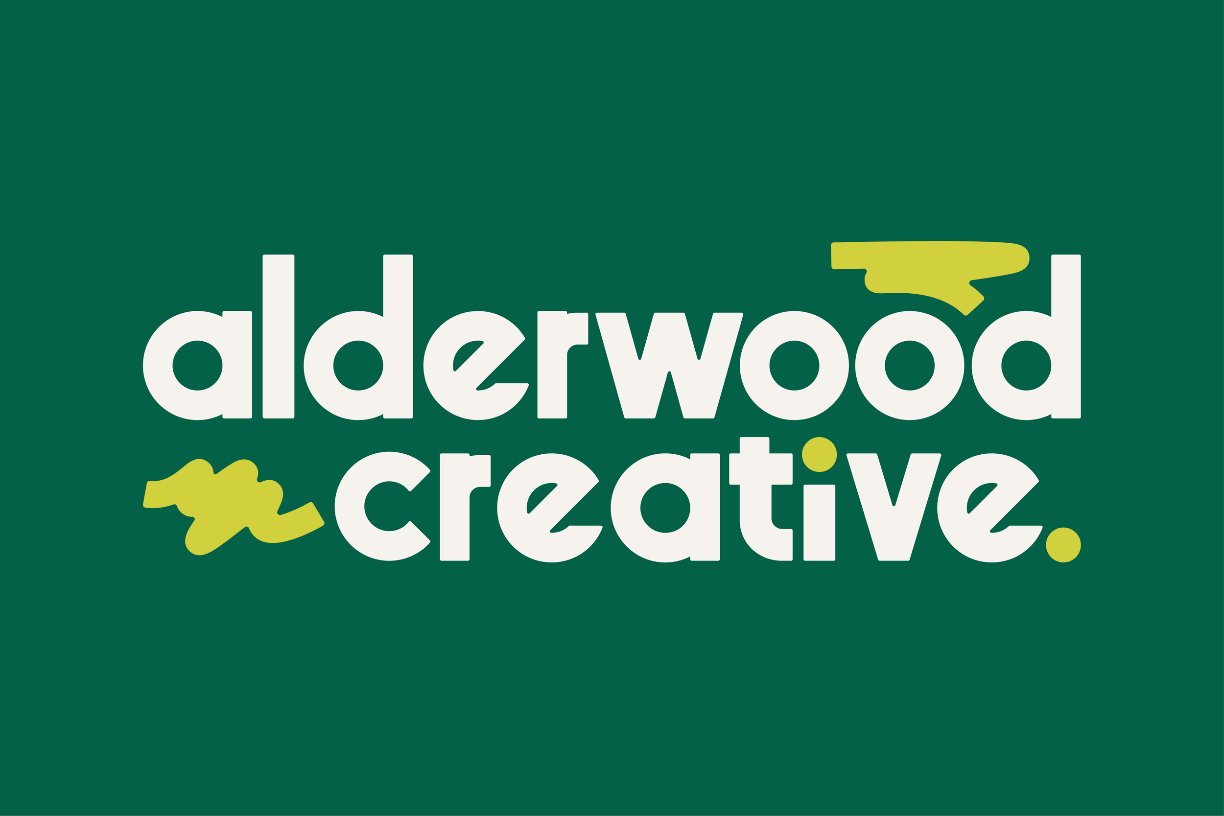
At the heart of the new identity is a visual nod to our founder’s creative writing background. I incorporated organic, flowing proofreading marks into the design, subtle yet meaningful elements that represent clarity, refinement, and a drive to improve. These marks not only connect to our founder’s roots but also reflect the agency’s mission to thoughtfully serve and elevate our clients and community.
The logo and overall visual system were designed to balance structure with creativity, offering flexibility while still feeling distinct and cohesive. It was important that the brand communicate a sense of confidence, approachability, and creative integrity.
-
The type system is rooted in a classic mid-century modern aesthetic, inspired by the building’s original function as a recording studio. This established, slightly nostalgic typeface brings a grounded feel to the brand, offering contrast to the more fluid proofreading marks. It adds a layer of personality and professionalism that sets us apart from other local agencies while remaining refined, creative, and fresh.
The color palette stems from the founder’s last name: Alder, a type of tree. In renaming the agency Alderwood, we leaned into that natural connection. Shades of green were chosen as a nod to the company’s previous branding, maintaining a sense of continuity. From there, we introduced a set of new secondary colors inspired by nature’s changing seasons, with each tone carefully chosen to reflect the diverse and evolving nature of our team and the work we do. The result is a palette that feels rooted, dynamic, and deeply personal to the agency’s story.
-
Alderwood Creative’s branding materials were designed to feel thoughtful, cohesive, and deeply connected to the heart of the brand. Each primary color is paired with a dedicated secondary tone, creating a flexible yet consistent visual system that carries through print and promotional items. This pairing reflects the seasonality and personality within the agency, while allowing materials to feel fresh and intentional across different touchpoints.
Custom iconography draws from the organic, flowing shapes of proofreading marks, subtle visual cues that mirror the logo and reinforce the brand’s editorial roots. Whether used on stationery, merchandise, or digital assets, these elements create a sense of movement, creativity, and attention to detail that defines the Alderwood Creative brand.
ALDERWOOD CREATIVE BRANDING MATERIALS