WOMEN’S FUND OF EAST TENNESSEE REBRAND + PRINT & PROMOTIONAL MATERIALS

WOMEN’S FUND OF EAST TENNESSEE ICONOGRAPHY + COLOR PALETTE


-
The Women’s Fund of East Tennessee was founded in 2011 to transform the lives of low-income women and girls in the region through grants, advocacy, and education. As a catalyst for opportunity, the organization needed a brand identity that not only reflected its mission but also resonated deeply with the cultural roots of the Appalachian community it serves.
During my research, one visual theme stood out: quilting. In southern Appalachia, quilting has historically been more than craft; it has served as a form of communication for women and minorities who were often excluded from formal education. This tradition of resilience, creativity, and storytelling became the foundation of the new brand strategy. The rebrand needed to capture that spirit of unity and empowerment while also positioning the Women’s Fund as a forward-thinking, collaborative nonprofit.
-
The logo mark was originally designed by Damian Zannini, the previous lead designer at my workplace, just before his departure. Building on his strong foundation, I expanded the mark into a broader visual identity system that could serve the organization long term. I developed a comprehensive style guide, along with brand patterns and supporting visuals, to create consistency and flexibility across all touchpoints.
To connect the logo more deeply to the brand’s story, I designed a series of minimal flower icons inspired by the geometric forms of quilt patterns. These icons extend the visual language of the brand while symbolizing growth, connection, and communication, values at the heart of the Women’s Fund’s mission. By uniting the existing logo with this expanded identity system, the organization gained a cohesive and recognizable brand language that feels both authentic and adaptable.
-
The Women’s Fund requested a palette that balanced both masculine and feminine qualities, symbolizing unity and the diversity of people the organization brings together. Drawing inspiration from nature and the regional heritage of Appalachia, I built a color system that feels rooted, inclusive, and versatile.
This palette provides flexibility for storytelling while ensuring materials remain cohesive and accessible across print and digital. Paired with typography that is both geometric and professional, the system communicates strength and confidence in equal measure, reflecting the dual goals of advocacy and independence.
-
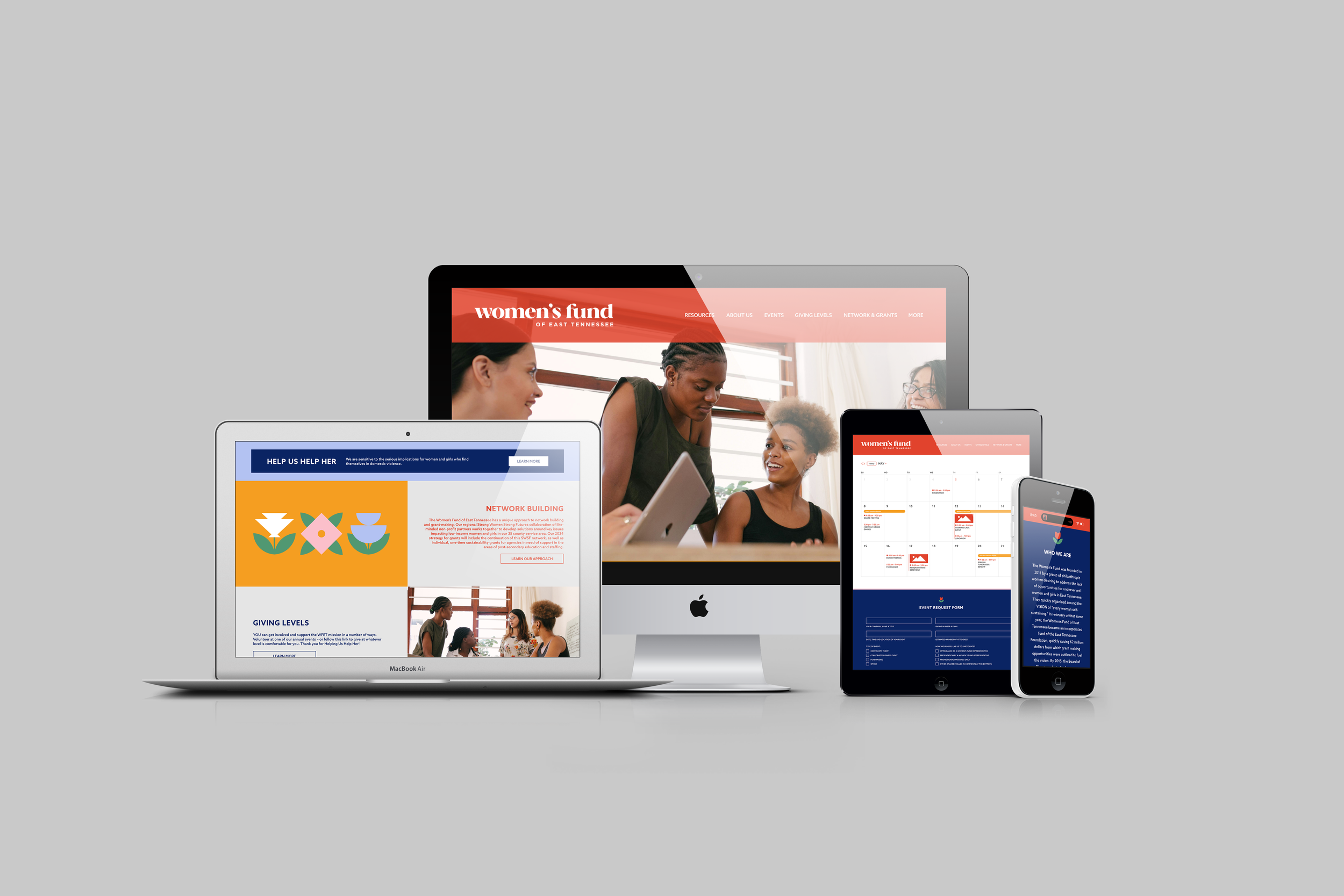
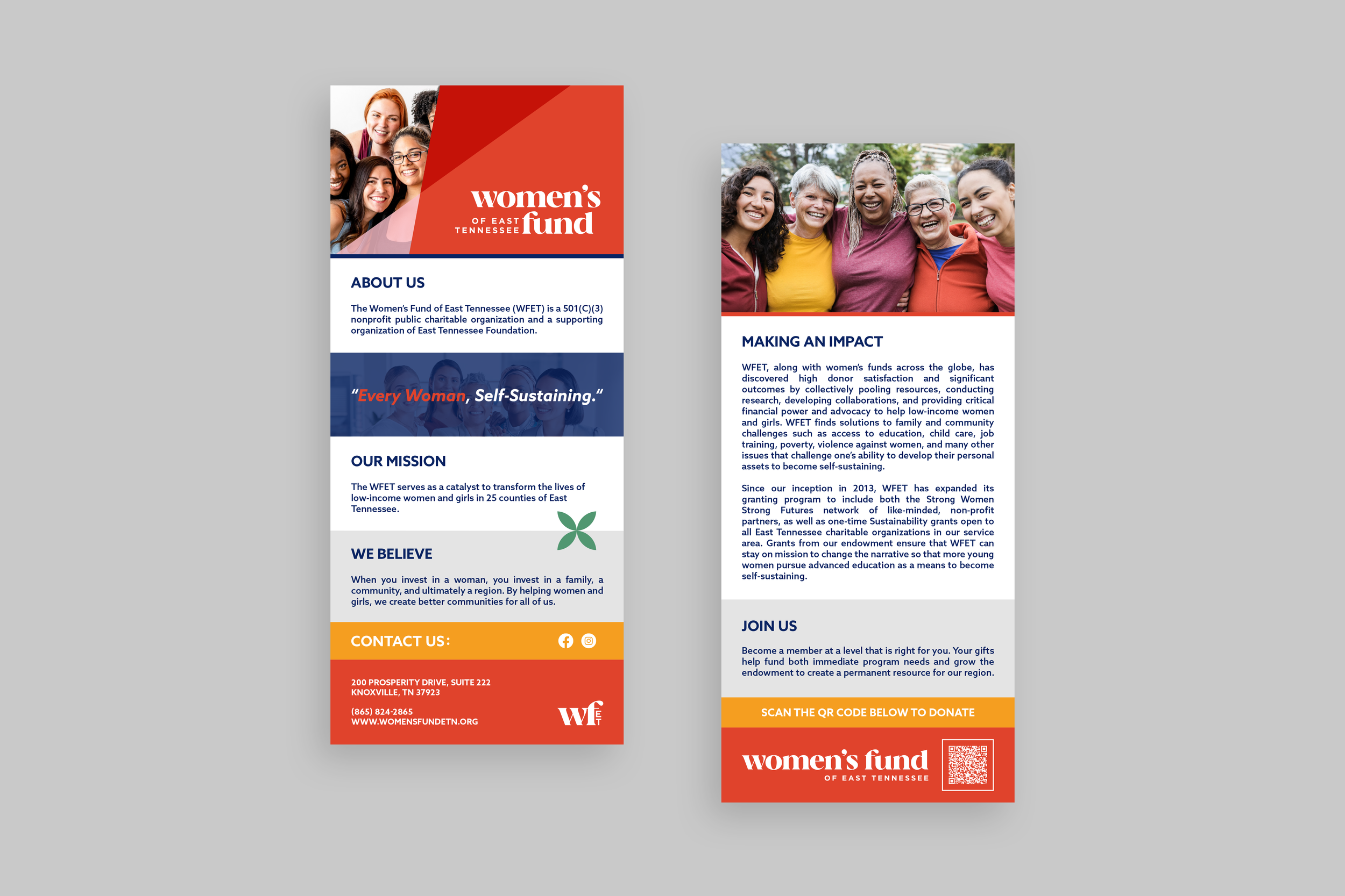
The completed brand system was designed to carry across a wide range of applications, from printed collateral to digital campaigns. Custom quilt-inspired patterns and floral iconography extend the identity beyond the logo, giving the Women’s Fund a distinctive yet flexible toolkit to work with.
Each material, whether a web page, social media post, or donor-facing piece, was crafted to feel intentional and aligned with the brand’s mission. The result is a system that reinforces the organization’s values of collaboration, education, and advocacy while visually rooting it in the traditions and strength of the Appalachian women it serves.